The bullet chart is a variation of the bar chart, and is used as an alternative to gauges for visualizing KPIs. The main advantage of the bullet chart is that it's easy to view and compare multiple measures and member elements.
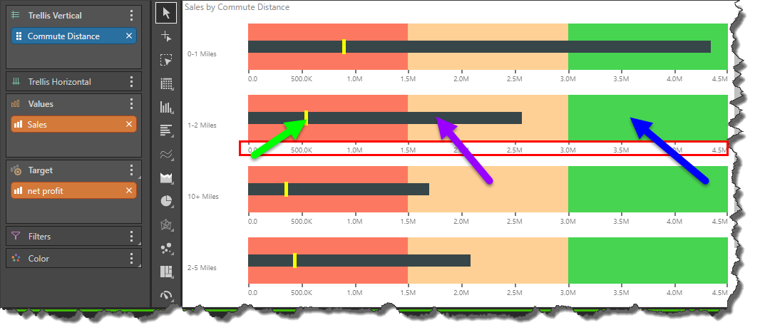
The bullet chart is comprised of a few visual elements: the qualitative scale (blue arrow below) measures the status of the metric. The quantitative scale (red highlight) measures the given values along a linear axis. The value measure, sometimes referred to as the 'performance measure', (purple arrow) displays the actual value as a bar. The target measure, often referred to as the 'comparative measure', (green arrow) is the measure against which you want to compare the actual value.
Build a Bullet Chart
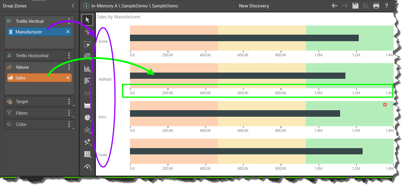
To build a bullet chart on the fly (without building a KPI in Formulate), start by adding a hierarchy to the Trellis Vertical drop zone. Add your actual measure to the Values zone.
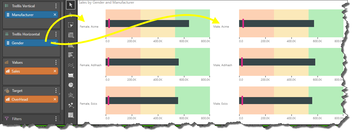
In the image below, we see that the Manufacturer hierarchy was added to the Trellis Vertical zone, driving the vertical trellising of the chart (purple highlight); each chart represents an element from the Manufacturer hierarchy.
The Sales measure was added to Values; this is represented by the bar in each bullet chart (green arrow). It also drives the scale of each chart (green highlight).
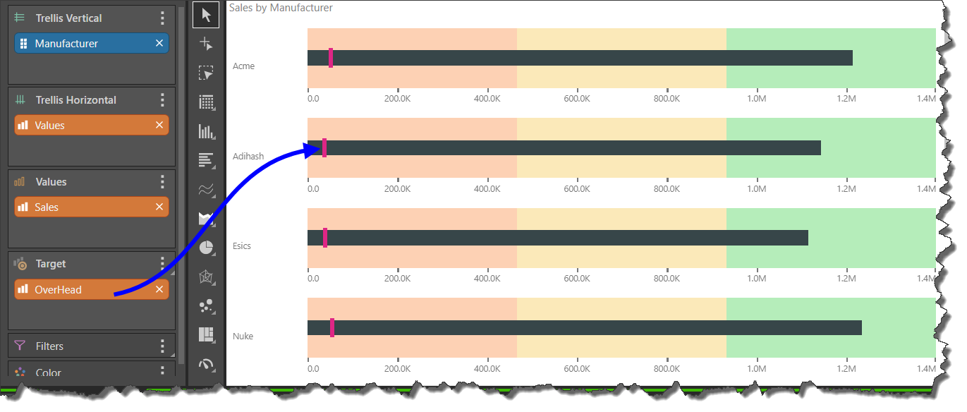
At this point, you need to add a second measure to the Target drop zone to drive the marker on each bar, which indicates the value of the target. Here, Overhead was added (blue arrow).
You can add a second hierarchy to Trellis Horizontal to add another set of elements to the visual. In the image below, the Gender hierarchy was added to create 2 columns of charts (yellow arrows).
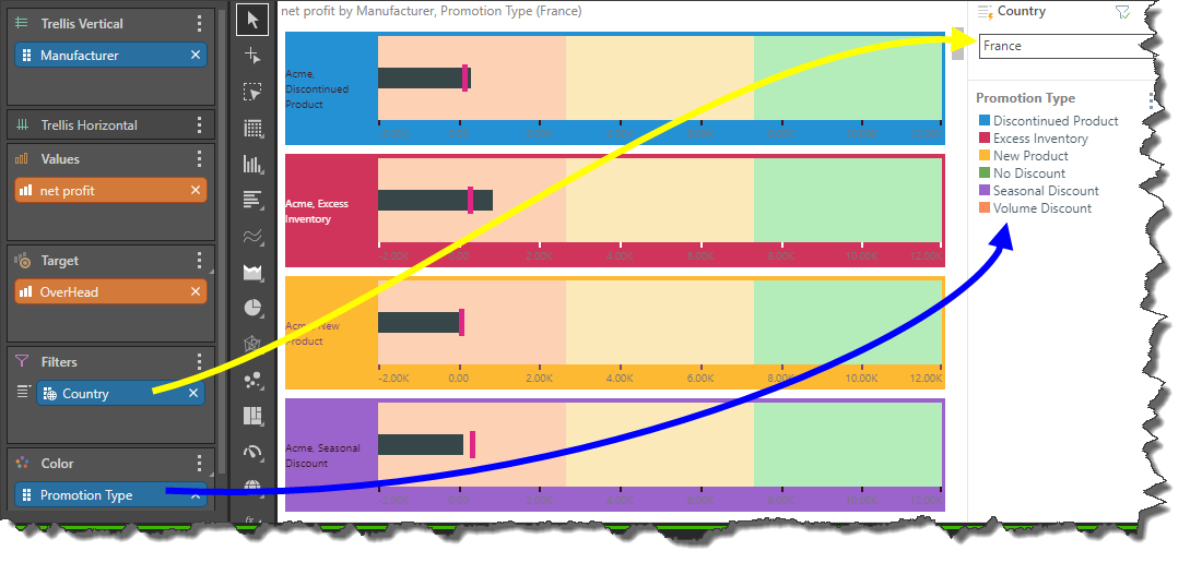
You can also add a hierarchy to the Filters zone to filter the query by the selected element (yellow arrow). And add background color logic by adding a hierarchy to the Color zone; this will drive the background color of each chart in accordance legend produced (blue arrow).
Build a KPI Bullet Chart
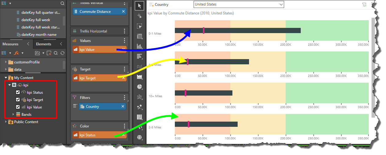
To build a bullet chart based on an existing custom KPI, find the KPI in the business logic tree (red highlight below). Select the KPI to add it to the visual. The KPI's 'Value' should be added to the Values drop zone; the 'Target' to the Target drop zone; and the 'Status' to the Color drop zone.
If you're building a KPI with the intention of visualizing it in a bullet chart, be sure to set the KPI style to 'Bullet' to prevent the Indicator drop zone from being rendered; unlike other KPI visuals, the bullet chart does not require the status indicator zone. Instead, the KPI's status chip can be added to the Color drop zone to ensure that your custom banding is displayed as the qualitative scale.